Teeket
Helping event creators turn attendance into an ongoing relationship.
I redesigned Teeket around creators, simplifying event publishing and connecting analytics with audience communication.
Teeket had existed for around three years, but its original experience was difficult to scale. I led a complete design refresh, covering the design system, event creation, ticket discovery and purchasing, analytics, marketing tools, and landing page.
The refresh also supported a shift in product direction. Traffic data showed that more visitors arrived directly on event pages than through the homepage. This suggested an opportunity: creators were bringing audiences to Teeket, and we could give them better tools to understand, reconnect with, and market to those audiences.
I helped translate that opportunity into a creator-focused experience, combining event analytics with a simpler publishing flow and an initial set of reminders and marketing messages.
Over approximately 10–12 months following the redesign, 21 creators held 14 events with more than 1,000 ticket-buying attendees. These figures represent platform adoption during that period, rather than the isolated effect of an individual feature.
My role & scope
I led the product design refresh, shaped its creator-focused direction, and worked with engineering to improve the shipped interface.
I owned the design refresh across the product and contributed to its strategic direction.
My work included:
- Defining and refreshing the design system.
- Redesigning the creator and attendee journeys.
- Designing analytics, reminders, and marketing messages.
- Repositioning the landing page around creator needs.
- Questioning feature requirements with the product lead and engineering team.
- Creating interactive prototypes that developers adapted to the existing codebase and APIs.
- Working in code to improve consistency between the designs and the shipped interface.
Developers owned the full production implementation. My involvement helped clarify behaviour, reduce ambiguity during handoff, and improve the fidelity of what shipped.
The problem & why it mattered
Teeket needed a clearer creation journey and tools that helped creators understand and reconnect with attendees beyond a ticket sale.
The existing product helped people create events and sell tickets, but the emerging opportunity extended beyond the transaction.
Creators wanted access to their past and present attendees so they could communicate, promote upcoming events, and maintain a relationship between events. Analytics could help them understand performance; communication tools could help them act on that understanding.
The product needed to support that relationship without becoming overloaded with features. It also needed a clearer creation experience and a consistent interface that engineering could maintain as the product grew.
How could Teeket help creators publish an event, understand their audience, and bring that audience back?
Evidence & key insights
Traffic and customer requests pointed toward creator needs, while implementation gaps made design consistency a product concern.
Creators were an important source of traffic
More visitors entered Teeket through event pages than through the landing page. This suggested that creators' promotional activity was an important route into the platform. That finding informed the creator-focused direction. The homepage could explain Teeket's value to organisers, while event pages continued to serve the audiences they brought.
Customer requests revealed needs, but not always broad demand
Requests helped us identify opportunities, but I examined the problem behind each one before adding it to the roadmap. Some requests addressed a recurring creator need. Others were specific to one event format and would require substantial engineering work without evidence of wider demand.
Design consistency was a delivery problem
For more than nine months, the implemented interface had struggled to match the design system. New features could look noticeably different from their intended designs. Improving the product therefore required closer involvement in implementation as well as refreshed design files.
Constraints & trade-offs
We prioritised evidence-backed creator needs that engineering could deliver, postponing broader features until demand was clearer.
We needed to learn about the new direction while keeping development manageable.
A recurring trade-off was whether to build a flexible feature immediately or start with a narrower version that could reveal how creators actually used it.
I prioritised requirements that supported the creator-focused direction, had evidence behind them, and could be delivered without overwhelming engineering. This meant postponing some appealing ideas until we had a stronger reason to build them.
Design strategy & key decisions
I simplified publishing, joined analytics with communication, started with fixed message templates, and challenged specialised requests.
1. Make publishing possible before asking for every configuration
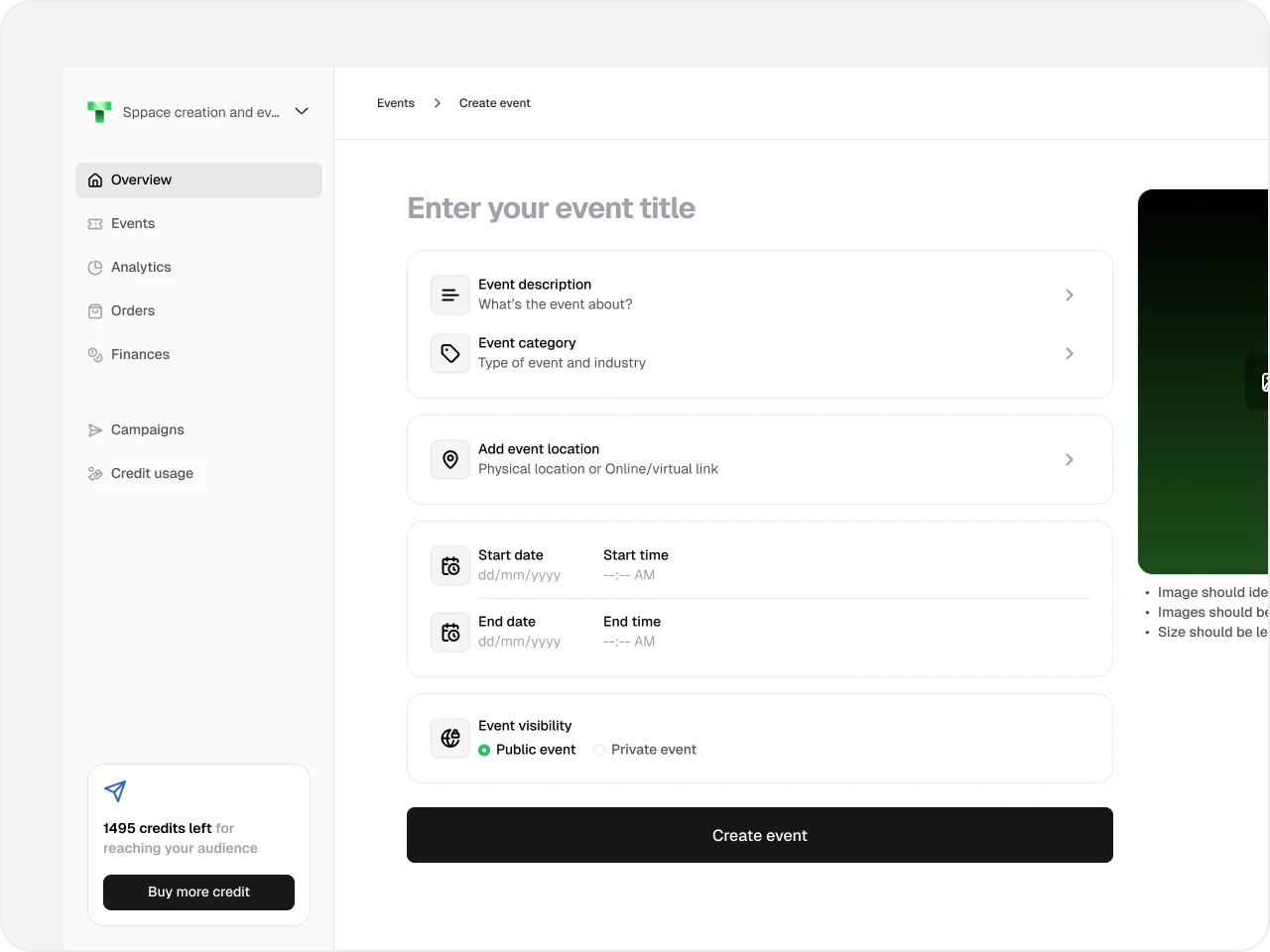
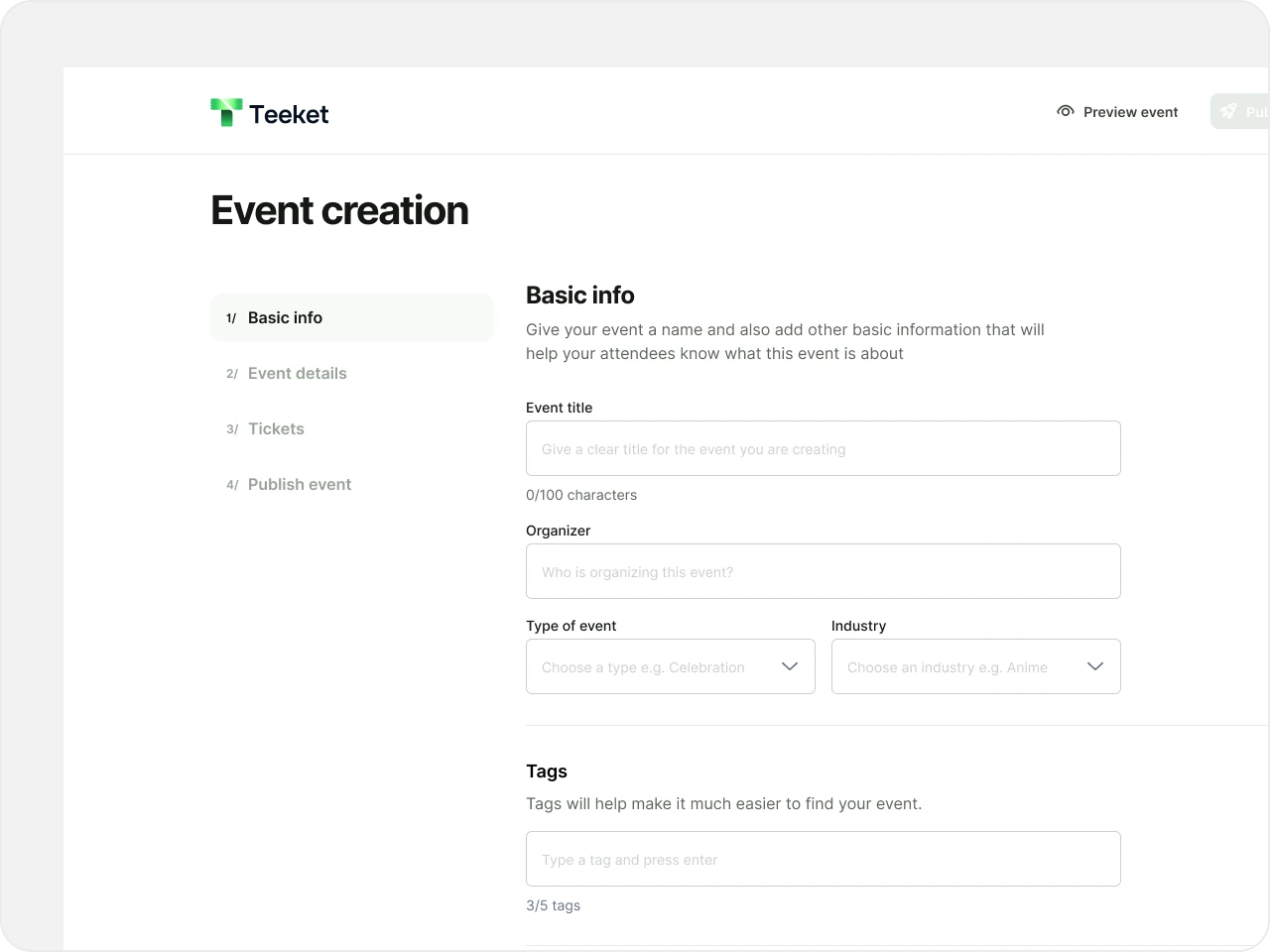
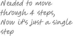
The previous event-creation journey required five phases. I reduced the required publishing flow to one initial step containing the essential event details.
Creators could publish after completing those details, then return to configure rules, reminders, and other settings.
This separated what was necessary to launch an event from what could be configured later, reducing the amount creators had to work through before publishing.
Required creation phases: five → one.
2. Connect performance insights with audience communication
I designed analytics to help creators understand their event performance, alongside tools for reminders and marketing messages.
Together, these capabilities supported the intended progression: create an event, understand its audience, and communicate with that audience again.
Analytics is live. Reminders and blasts have recently launched, so their effect on engagement and repeat attendance is still to be evaluated.
3. Start with predefined messages before building a template editor
The engineering lead proposed a template builder for reminders and blasts. I recommended starting with a fixed set of templates.
This gave us a smaller initial release and an opportunity to learn which messages creators used, what they wanted to change, and whether a more flexible builder was necessary.
The decision kept development focused while leaving room to expand based on actual usage.
4. Question specialised requests before committing engineering time
One customer requested an event structure with multiple workshops, each with a separate ticket connected to a parent event. I explored the requirement with the product lead. At that point, we had no clear signal that other customers needed the same structure.
I recommended keeping it out of the pipeline until broader demand emerged. The request was useful evidence of one customer's situation, but insufficient evidence for a substantial platform capability.
5. Align the landing page and shipped interface with the direction
I shifted the landing page's emphasis towards creators and experiential marketing, reflecting where the business was going.
I also worked more closely with the code and design system to address implementation inconsistencies. This helped bring the shipped experience closer to the intended design and established a stronger foundation for subsequent features.
The experience
The redesigned journey lets creators publish, configure, understand performance, and communicate with attendees.
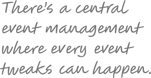
The redesigned creator journey supports a connected set of tasks:
- Publish: complete the essential details and get an event live.
- Configure: return to adjust settings as needed.
- Understand: review event performance through analytics.
- Communicate: use predefined reminders and marketing messages to reach attendees.
The landing page introduces this creator-focused proposition. Event pages and ticket purchasing continue to support the attendee experience.
Validation & iteration
Creators, prospects, and the internal team tested features and helped distinguish useful needs from one-off requests.
We tested designs with existing users, prospective clients, and the internal team.
Creator and prospect sessions
When features launched, we shared them with creators and gathered feedback. Prospective customers also tried the product during outreach, giving us opportunities to observe difficulties and examine new requests. Internal usability testing provided another route for identifying issues.
Using requests to understand intent
The feedback informed both interface changes and scope decisions. We used requests to understand what customers were trying to accomplish, then assessed whether the proposed feature was the right response.
The next evaluation focus is how creators use reminders and blasts, and what their behaviour tells us about the need for greater flexibility.
Outcomes & impact
During roughly 10–12 months after the redesign, 21 creators held 14 events with over 1,000 ticket-buying attendees; feature-level impact remains unisolated.
Following the redesign, over approximately 10–12 months:
Platform adoption results:
Analytics and the new creation flow are live. Reminders and blasts have recently launched. These results describe adoption following the broader redesign. We do not yet have evidence that isolates the contribution of analytics or the new marketing tools.
Reflection & next steps
We will use creator behaviour to refine the live experience and expand its capabilities only where evidence supports them.
Building towards a new product direction required us to move quickly while repeatedly checking whether each requirement belonged.
Questioning requests helped us distinguish a broad creator need from a one-off event requirement. Starting with predefined templates gave us a way to learn before committing to a more elaborate system.
The next step is to examine usage, refine the existing features, and expand where evidence supports it. I will continue working closely with engineering so that new capabilities retain the consistency and quality of the redesigned experience.
Redesigned Teeket around event creators, simplifying publishing from five phases to one. In the following 10–12 months, 21 creators held 14 events with 1,000+ ticket-buying attendees.


